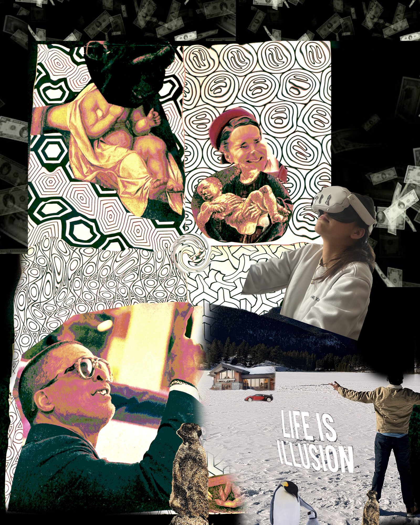
Final Project · Module 05
№ 05 / Final Project
Digital Portfolio · Module 5
Digital Design
Spring Semester 2026
Five Curated Works
Collage · Type · Mark · Emotion · Final

Making things that feel like something.

A portfolio by Samik Dahal — a surreal collage, three pinback buttons, a coffee-shop logo, an emotion reel, and a final logo redesign — made across a semester of learning to make things that feel like something.

Student
Samik Dahal
Scroll
§ 01

Selected works

Five pieces · 2026
№ 01 Collage · Composite Identity

Life is Illusion

Money rains. A Renaissance body floats. A girl puts on a headset and looks up. I'm holding the phone, the penguin's watching — everything is real and nothing is.

Reflection

I built this around one phrase — Life is Illusion — and let the fragments gather. Falling dollar bills frame a Michelangelo body holding a flayed skin, a woman in a VR headset reaching for something, a winter cabin with a supercar, me at the bottom-left in glasses, meerkats and penguins watching. The warp of the patterned papers and the heavy saturation were chosen to make every surface feel slightly uncanny, like a dream where you can tell it's a dream.

Tools Photoshop Format JPG · 1600×2000 Date Day 4 · Project 1
Life is Illusion collage — money bills, Renaissance figures, VR headset, winter cabin, penguins, and the phrase LIFE IS ILLUSION
Hero · Yellow Yellow pinback button reading IMAGINATION IS NOTHING WITHOUT DOING
V1 · Chaplin Pinback button with Charlie Chaplin portrait and text around the rim
V3 · Sunset Pinback button with silhouetted figure against orange sunset
№ 02 Typography · Pinback Buttons

Imagination is nothing without doing

Three physical buttons, one Chaplin quote — the difference between a first attempt and a final design lives between them.

Reflection

I printed and pressed these as real pinback buttons. Version one used a Chaplin portrait with curved text around it — too busy, the rim type became unreadable. Version two was the silhouette at sunset — romantic, but the text disappeared against the sky. The yellow final landed because I stopped trying to decorate the quote and let the typography carry it. Bold serif, high-contrast black on saturated yellow — it reads from six feet away.

Tools Illustrator, button press Format Physical · 1.5" pins Variants 3
№ 03 Identity · Logo Design

Quiet Cafe

A single coffee bean, split open on its horizon line — and a promise: sip, relax, repeat.

Reflection

I wanted a mark that felt like the first quiet sip of the day. The logo is a single coffee bean split into two halves, rendered with a soft gradient so it catches light, sitting on a horizon line that divides deep espresso from warm grounds. The wordmark uses an outlined slab serif — open enough to breathe, weighty enough to feel printed. I designed two variations: one full-bleed for signage, one circular for stickers, labels, and app icons. The tagline sits in cursive to soften the architecture of the whole thing.

Tools Illustrator Format JPG · 1600×2000 + circular Variations 2
Quiet Cafe logo — a stylized split coffee bean with wordmark and tagline Sip, Relax, Repeat
№ 04 Emotion Project · Observational Reel

Final Submission Anxiety

Six short loops of a desk under deadline — the texture of anxiety, not dramatised, just present.

I
II
III
IV
V
VI

Concept

The brief was an emotion. I chose the one I was actually feeling — the tight, metallic hum of a deadline closing in. Six short loops of a desk under pressure: the keyboard, the unfinished screen, the speakers failing to drown out the clock. Not dramatic, just present.

Tools & Process

Shot handheld across three evenings, edited in Premiere with the colour balanced toward the warm, low-key palette of the room. Each clip is under seven seconds — short enough to loop without announcing itself, long enough to feel the anxiety coil and release. The six-channel format came from the idea that anxiety isn't one long feeling; it's the same feeling, in loops.

Medium 6-channel observational loop Tools Premiere Pro Total length 00:30 Format MP4 · H.264 · Muted loop
№ 05 Final Submission Project · Identity Redesign

Quiet Cafe, Remade

A return to the third project — the Quiet Cafe logo, rebuilt twice: one stripped to silence, one pressed into a badge.

V1 · Minimalist Quiet Cafe minimalist vertical logo with coffee bean, steam wisps, and the tagline Brewed in Silence Brewed in Silence
V2 · Vintage Badge Quiet Cafe vintage circular badge emblem with gold rings, split coffee bean, and the tagline A Pause in Every Pour A Pause in Every Pour

Concept

For the final submission I came back to Quiet Cafe — my third project — and asked what else it could be. The first version was earnest but soft. These two are my answer to the same brief from different directions: Minimalist strips the logo down to a single bean, steam wisps, and a quiet serif wordmark. Vintage Badge presses the identity into a gold-ringed emblem that could be stamped on a coffee bag tomorrow.

Tools & Process

Made in Adobe.

Medium Two logo variations Tools SVG, Illustrator Format Vector · Scalable Variations Minimalist + Badge
§ 02

Artist Statement

≈ 300 words

Creative Process

I work from the edges in. I start by collecting — scraps, screenshots, a quote typed at the end of a day, a scanned texture I can't explain why I like. The idea arrives later, when the material has been sitting long enough that a pattern shows itself. My best work this semester came out of notebooks I'd meant to throw away.

Conceptual Thinking

The five pieces above are all about attention, in different registers. Collage trains the eye to value fragments. Type asks what a single character can carry. A logo is concentration reduced to a line. The video works are about the attention behind the work, not the work itself. I'm interested in the quiet middle state — neither concept nor execution, just noticing.

Design Decisions

Three decisions recur through all five pieces: I choose restraint over decoration, I let one element dominate rather than balancing everything, and I leave visible evidence of the hand — a scan line, a texture, a framing that could only have been chosen by a person. Taste, for me, is the willingness to keep removing until the thing is specific.

Skills Developed

Technically, I learned to use variable fonts with intention, to grade video in Premiere, and to build compositions that hold at any scale. More importantly, I learned to wait. Most of this semester was spent not-finishing — sitting with drafts, keeping them visible, coming back. That patience, I think, is the actual skill.

≈ 300 words · Spring 2026
§ 03

About & Contact

Available for collaboration

Hi, I'm Samik.

A designer-in-training based in Denver. I work across print, type, and moving image, and I'm most interested in the overlap between editorial craft and small-moment observational video.

Currently looking for summer internships in editorial design or independent studio work. I take lettering commissions. I answer emails slowly but thoroughly.

Course
Digital Design · Module 5 — Digital Portfolio
Based in
Denver, Colorado
Instagram
@samik.dahal
Also online
Reading list, occasional zines, and a slow-updating journal — available on request.